By Rishab Narang
The 10th version of OS X, Mavericks, felt like an afterthought in the midst of Apple's radical overhaul of its mobile operating system. In this case, rather than completely overhaul the look and feel of the entire platform, Apple has instead picked its spots, removing and adding features in particular places while all the while tuning for performance and efficiency throughout. I’ve been testing a very early version of Mavericks (it's due out this fall) on a 13-inch MacBook Pro with Retina display, and I appreciate what Apple’s done here: it’s systematically fixing what was broken, without tampering with the parts it got right.
For the most part, Mavericks looks and feels just like Mountain Lion, and Lion before it. There’s a new background, but everything from the dock to the menu bar to how you use your computer will feel completely familiar. The changes here have less to do with how you do things than what you use to do them: Apple’s hoping to obviate some of the App Store’s best offerings, instead giving you better versions of its core apps and a few new ones besides.
For the most part, Mavericks looks and feels just like Mountain Lion, and Lion before it. There’s a new background, but everything from the dock to the menu bar to how you use your computer will feel completely familiar. The changes here have less to do with how you do things than what you use to do them: Apple’s hoping to obviate some of the App Store’s best offerings, instead giving you better versions of its core apps and a few new ones besides.
NOTIFICATIONS
If the only change in Mavericks were an improvement to OS X notifications, it’d still be worth the 4.79GB and the hour or so it takes to install. On one hand, you now get more notifications than ever — many of the same things you’d see on your phone now come to your computer as well. You can also now interact with your notifications, in an awesomely Android-like touch; click on a Messages notification to reply inline, or delete an email without ever needing to open the app. I can’t help but hope that Apple brings the same thing to iOS 7 sooner rather than later.
Mavericks is worth the upgrade for in-notification replies alone
Notifications are more accurate and more immediate, though it’s still not nearly as full-featured and customizable per app as Growl, and unfortunately you can’t prevent the notifications from taking over the top-right corner of the screen, which is the last place I want them to be. I particularly appreciated the addition of a more obvious Do Not Disturb mode, which makes it easier to shut out the world and get some work done without email notifications getting in the way every ten seconds.
Though Apple didn’t mention it in its keynote or the Mavericks release notes, Messages has also been improved. Which is to say, it’s not a huge mess anymore: the app is much faster, almost never beach-balls while it loads, and no longer seems to crash my computer every time I try to send a text message.
DISPLAYS
OS X has never been good with multiple displays, and things only got worse with Mountain Lion — if you have an app set to full-screen, the other monitor just becomes completely useless. With Mavericks it’s much smarter: you can run a full-screen app on each monitor, which is what it should have been all along. There’s also now a menu bar on each screen, you can move the dock wherever you want, and each screen’s Expose feature shows only the apps on its monitor. Even AirPlay is better, allowing your TV to be a wireless secondary display instead of just forcing you to mirror at awkward resolutions.
Using multiple displays works like it always should have
It’s all pretty seamless, and the setup feels like it should have been all along. If you use multiple monitors, you previously had to choose between using Apple’s cool features and actually taking advantage of your two monitors. Now it just works.
 Calender in OS Maverick
 The same, only better
CALENDAR
There’s always been a Calendar app for OS X, but for the first time you might actually want to use it. Apple has done away with the horrible leather-bound, torn-paper skeumorphism, toned down the color scheme, and offered a calendar app as sleek and simple as anything from Google Calendar to Fantastical. You can now add notes or invite people to an event right from the Week or Month view, instead of having to click in to the individual event, and the app pulls in your Facebook events if you’re logged in at a system level. Still, the real difference here is just how much more pleasant the app is to look at and use.
 Notes in OS Maverick
 NOTES
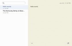
There’s a none-too-subtle theme to the early changes in Mavericks, and it’s "goodbye skeumorphism." Where Notes used to look like a yellow legal pad with the first few pages ripped out, now it looks like... an app on a computer. It’s still a simple two-column app, and even has an oddly textured yellow background, but there’s no more ugly font, no more unnecessary chrome, and no more legal pad. As with Calendar, that’s improvement enough.
There’s a none-too-subtle theme to the early changes in Mavericks, and it’s "goodbye skeumorphism." Where Notes used to look like a yellow legal pad with the first few pages ripped out, now it looks like... an app on a computer. It’s still a simple two-column app, and even has an oddly textured yellow background, but there’s no more ugly font, no more unnecessary chrome, and no more legal pad. As with Calendar, that’s improvement enough.

FINDER
One of the first things most power users did upon buying a new Mac was install an app like Path Finder, which added a handful of key features to Apple’s default option: you could have multiple tabs in one window, sort things by tags, and much more. The big one was tabs, though — being a Mac user otherwise involves having dozens of Finder windows open for no discernable reason whatsoever.
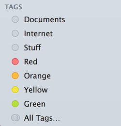
Mavericks adds tabs to the built-in Finder, which makes a huge difference. Not only do you have mercifully fewer windows open at a time, but it makes moving things around far easier — instead of having to align two windows side by side and drag things between them, just open your source and destination as tabs and drag things from one to the other. Meanwhile, Apple repurposes its colored labels as tags and lets you add others, so you can see everything you’ve marked red all in one place — or see everything that’s yellow, or that you tagged with both "Home" or "Pictures of my cuter kid to show everyone." You can tag things within Finder, or even within some apps while you’re creating the document in the first place — it’s already helped me get away from the incessant folder maintenance I’m used to. In my testing so far, Finder’s also much less buggy and prone to freezing and crashing than it used to be.
These are still early days for OS X 10.9, and Mavericks will likely change and shift much more before it’s released this fall. It’s clearly not going to be the total aesthetic overhaul iOS 7 is, though, and that’s okay. It’s a simple, familiar operating system, even less of a change than Mountain Lion, just with nips and tucks and a whole lot fewer sheets of weirdly torn paper.
Nearly everything that needed fixing has been tended to
It has its bugs, sure, but it’s also corrected a number of bugs that somehow made it into the final version of Mountain Lion, and even at this early stage is impressively stable and fast. It’s gotten rid of a lot of the design issues that plagued many Mountain Lion apps (except for Game Center, which is still hideous), in favor of a cleaner, softer look that is far easier on the eyes.
Again, it’s still early, but it seems like Mavericks is going to be a must-have update for Mac users of all shapes and sizes, whether you want the new features or just a big performance boost.

 RSS Feed